Atlas of the Copenhagens
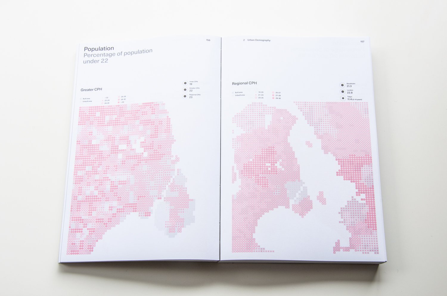
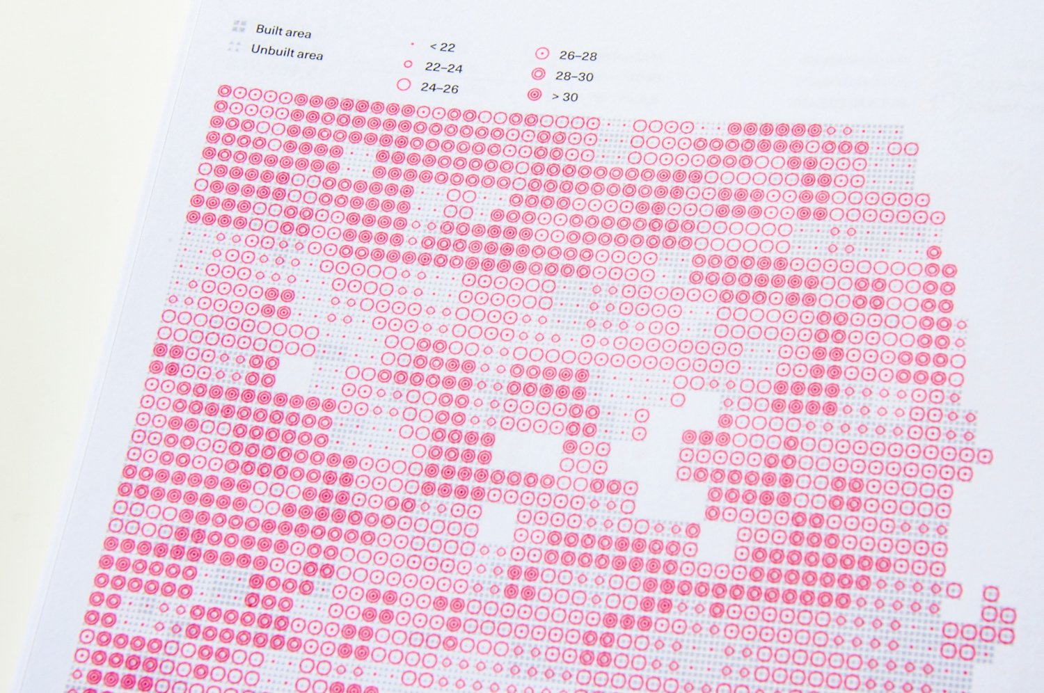
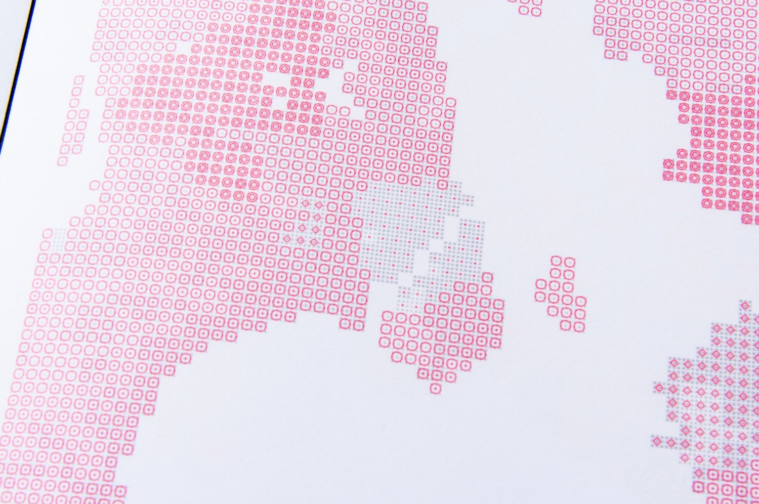
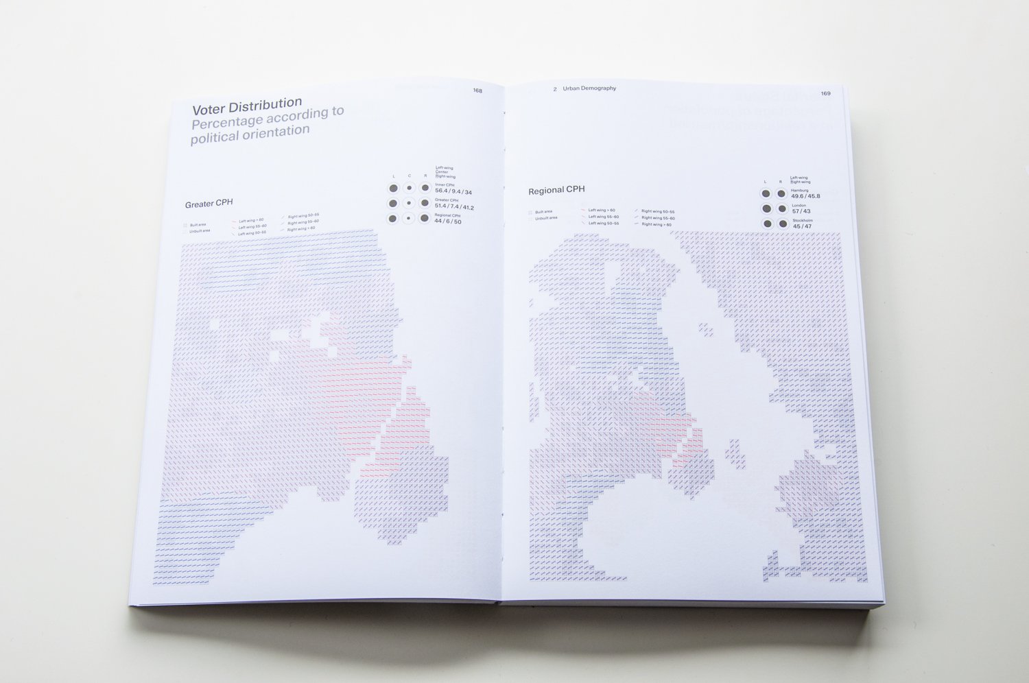
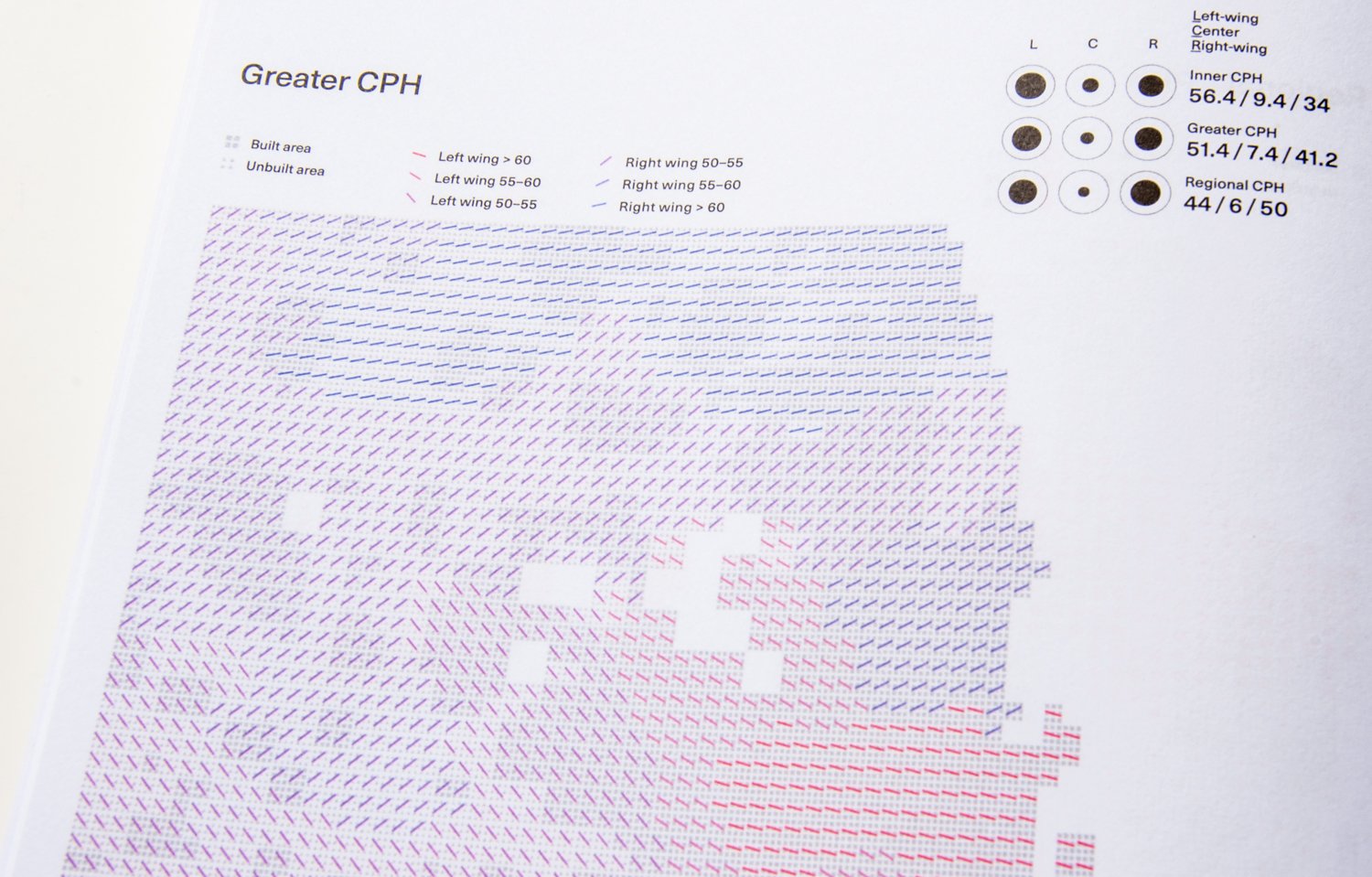
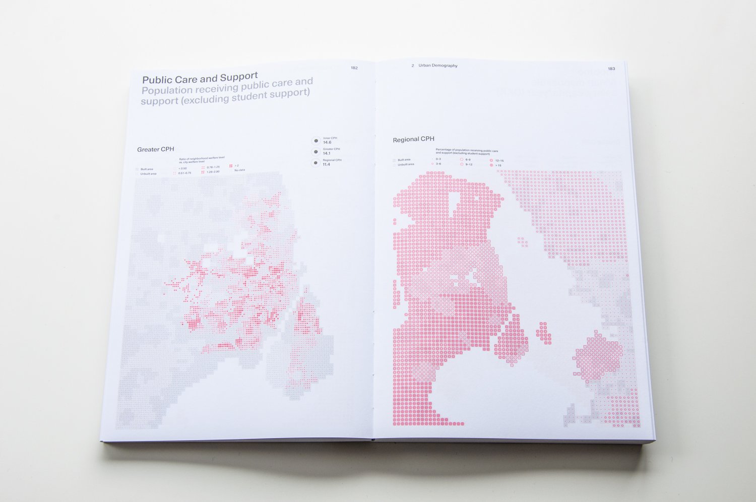
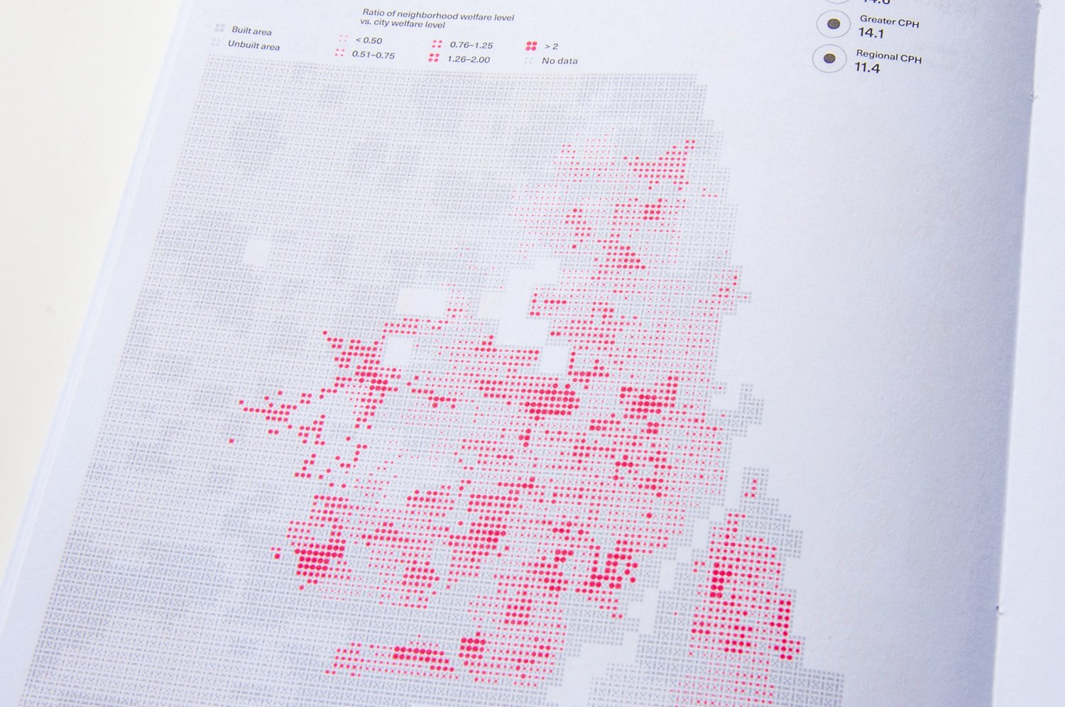
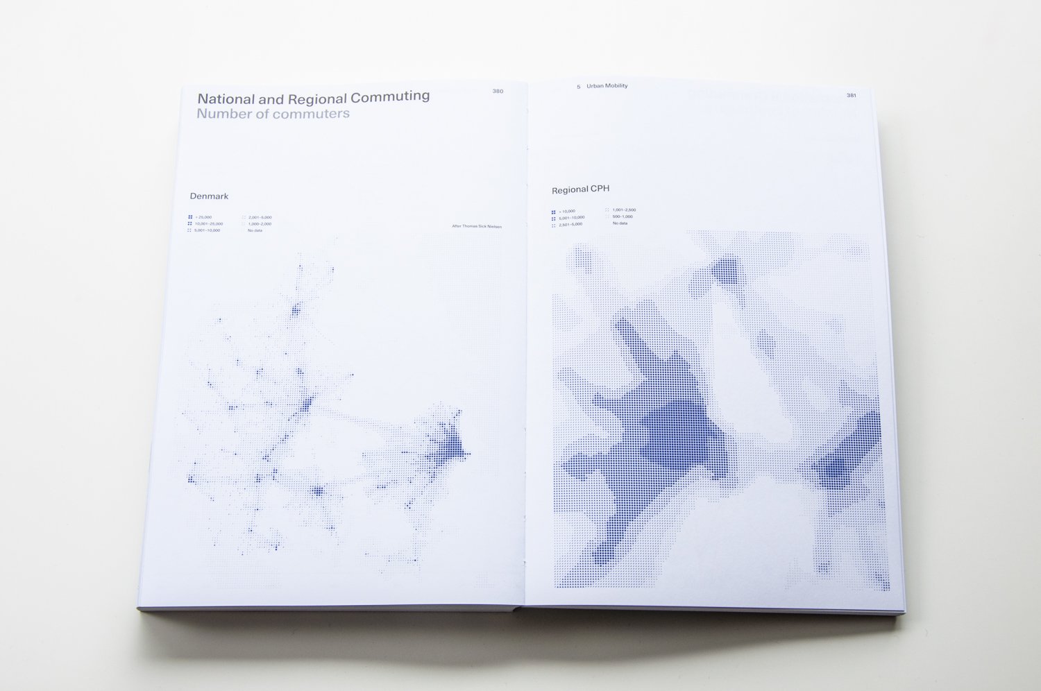
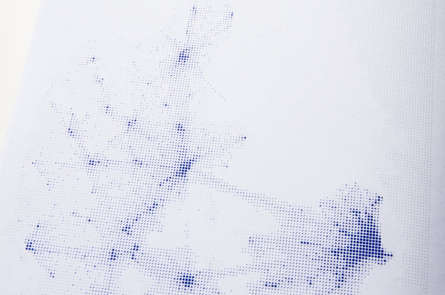
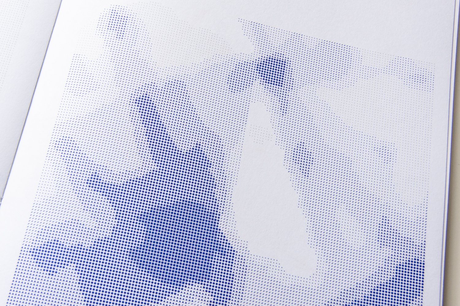
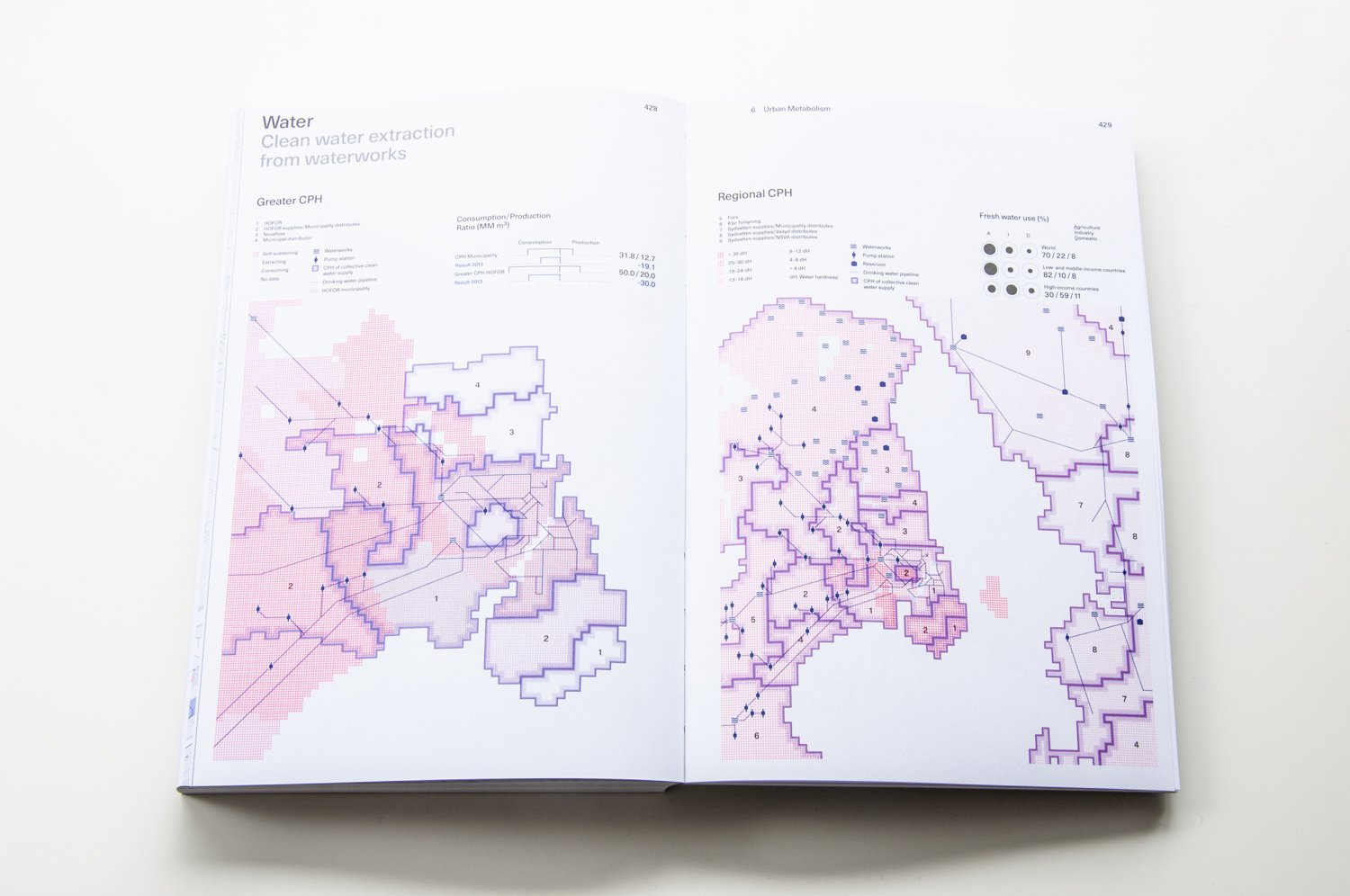
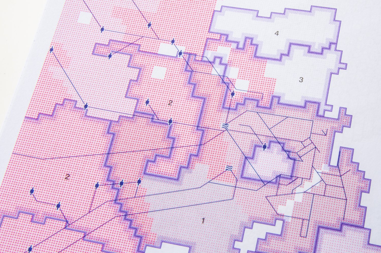
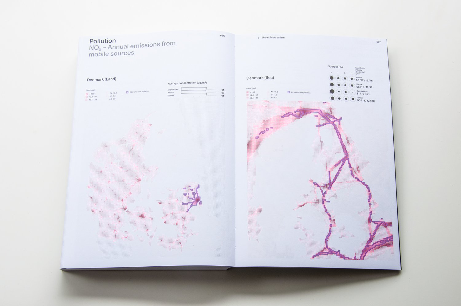
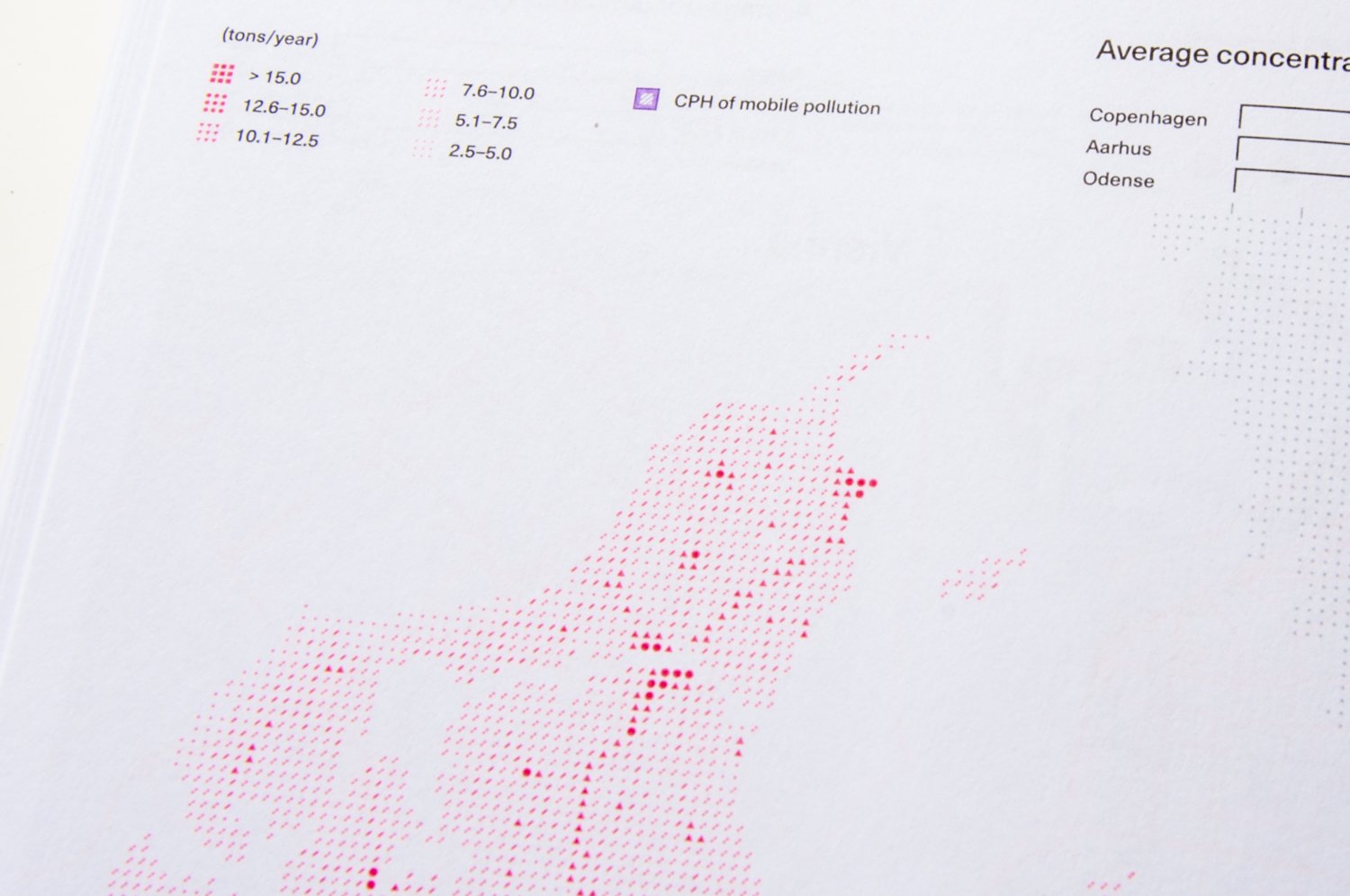
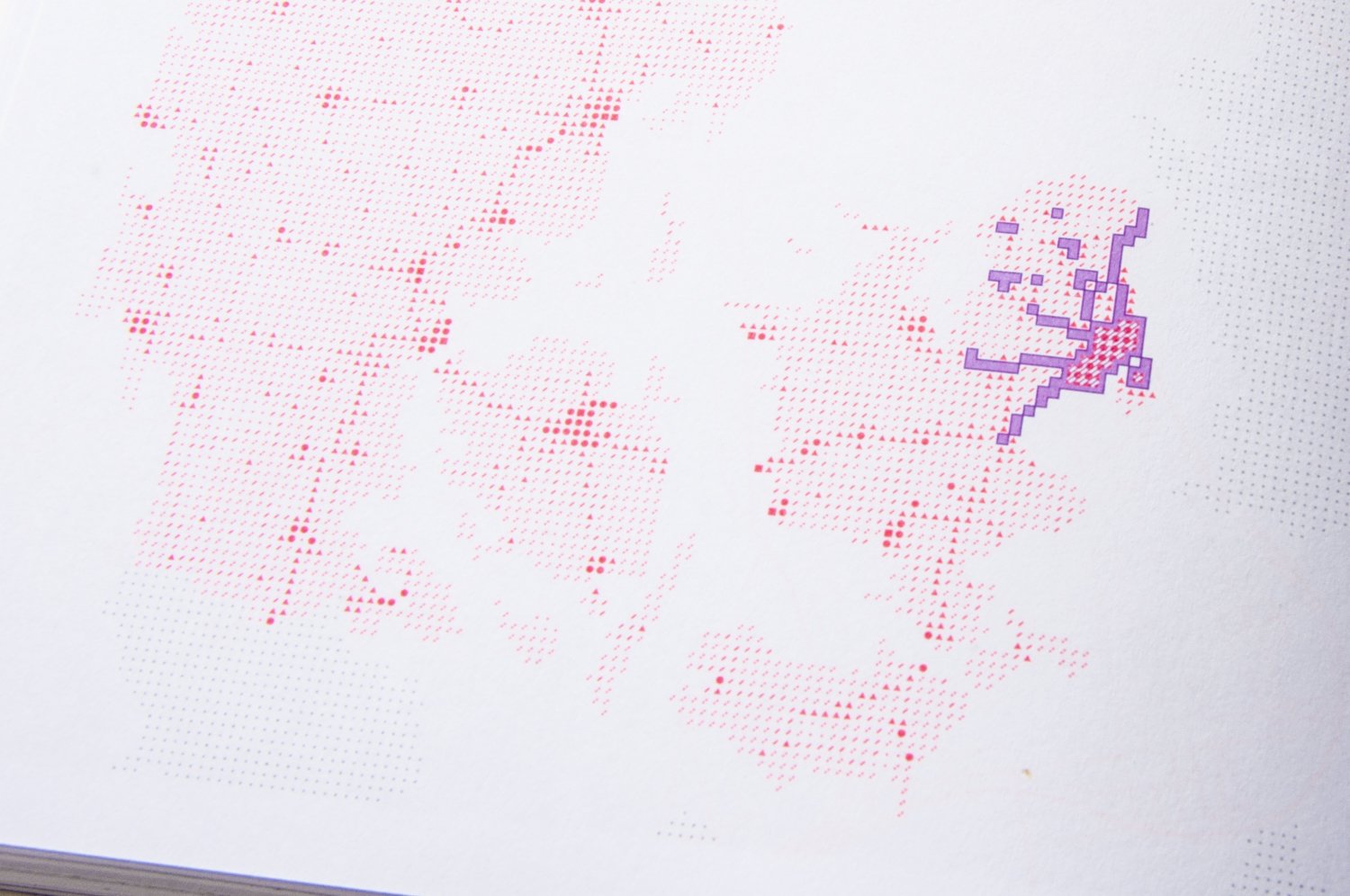
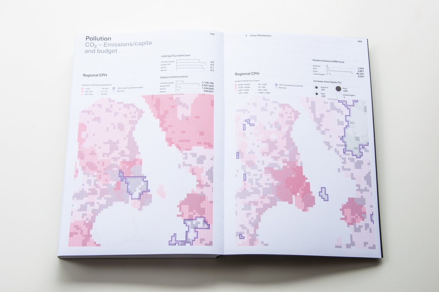
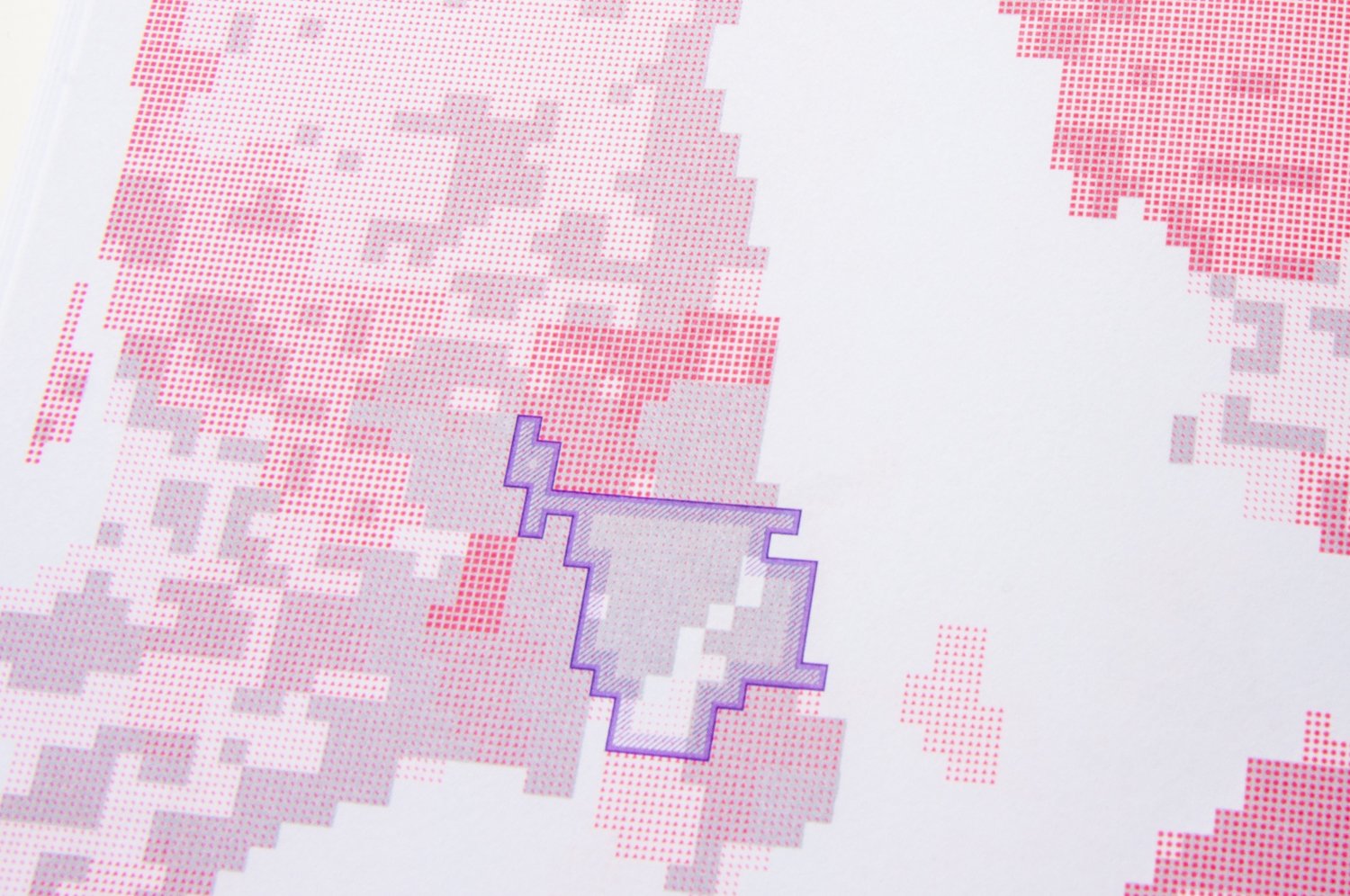
The task was to apply a color gradient to grid-based maps displaying statistics for the city of Copenhagen. Instead of using variations in ink intensity to create a gradient, a series of single to triple circles were utilized to create a range of colored-line densities. This technique used a combination of shapes including solid squares, circles, triangles, lines, dotted lines, and small dots, resulting in a pixelated display with varying levels of ink content. These unique color gradient systems offer an overview of data distribution from a distance and provide a surprising level of detail upon closer examination.
コペンハーゲンの統計データを、グリッドをベースにしたグラデーションで表すことが求められていました。インクの濃度によってグラデーションを表現する代わりに、線の密度を用いたり、四角・丸・三角・線・点線・点など形の違いを活用して同様の効果を生み出しました。離れてみた時にはグラデーションとして見え、細部に目を向けると実はアイコンが用いられている視覚的効果を生んでいます。